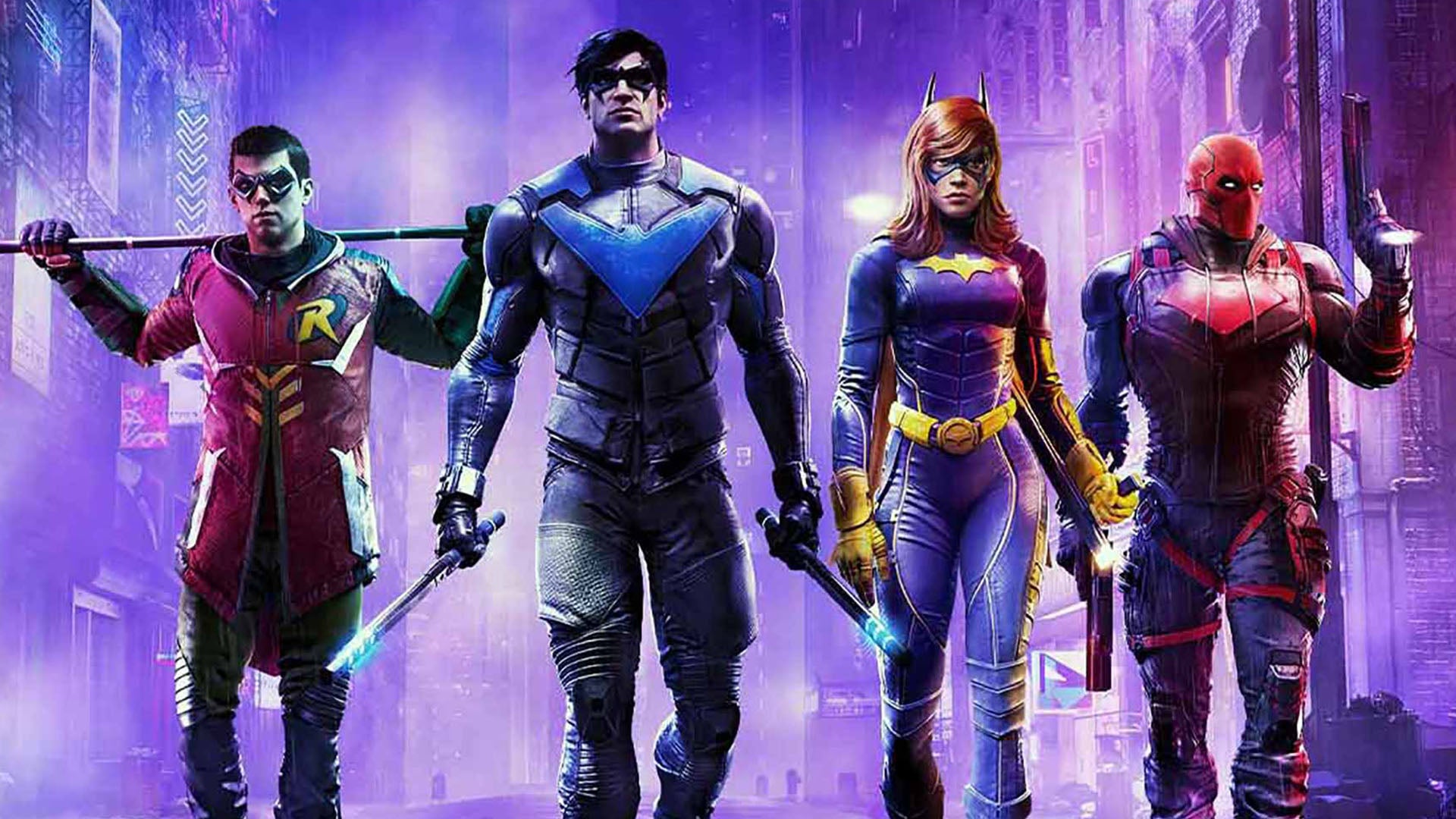
Gotham Knights has some big shoes to fill as a follow-up to the brilliant Batman Arkham Knight, an early last-gen title that pushed graphical and gameplay boundaries. Even today, the Rocksteady game impresses with a gritty, rain-soaked rendition of Gotham City swarming with criminals. Unfortunately, Gotham Knights fails to hit the same heights from a gameplay perspective, while there are big questions about its technical make-up. Why limit performance to 30 frames per second? Why were the last-gen versions cancelled with little technical ambition here? And after Arkham Knight, how come the game looks visually underwhelming?
The cancellation of the last-gen versions is puzzling because this is a thoroughly last-gen title in terms of its basic visual make-up – expect to see decent-looking PBR materials, a baked global illumination system, and extensive TAA coverage. Even relative to eighth-gen standards though, this isn’t great stuff. Characters and other dynamic objects often stick out dramatically from the environment, for instance, lacking any sort of cohesion within the GI system. This is a common issue when dealing with baked GI of course, but the results here are often poor – with characters often looking like they have no integration into the game lighting at all, weirdly glowing. When lots of dynamic lights are onscreen there’s a closer match between the lighting systems, as would be expected, but under primarily indirect lighting the results can look odd.
There are other issues with the lighting and shadowing. Ambient occlusion is quite restrained here, so geometry doesn’t seem grounded very effectively within the environment. Specular highlights are another concern, which are often misaligned with the objects onscreen. This tends to stick out quite a bit as the gameworld is always dark and rain-slicked, in typical Batman fashion. These aren’t huge issues taken individually but they make Gotham City feel disjointed. Overall the city feels quite clinical and much less stylised than you’d expect. Gotham has a certain visual signature in other media, a version of New York City with an emphasis on older architectural styles, often portrayed at night and with heavy rain.
Here Gotham doesn’t distinguish itself from other open-world titles. The city layout itself is wide-open and modern, with broad avenues, a simple grid layout, and contemporary building styles. Objects in the far distance are often quite easy to see given the lack of smoke and other visual obstructions. Most baffling however is the lack of rain. If you look very closely you can spot rain in most outdoor scenarios, but it’s barely visible, never rising to anything above a mild drizzle. The game’s visual design just doesn’t make much sense, especially considering how the city is depicted in other titles, especially Arkham Knight. This is a pretty serious and grimy game that takes place after Batman has been killed, so the clean and somewhat generic look just doesn’t feel appropriate.
